
If I had it my way, I would paint every wall in my house some shade of light gray-blue-green. I always end up recommending this color to people and have just about every shade offered by major paint companies memorized by name (true story). It creates such a soothing yet sophisticated look, you really can't go wrong with using this in any room. I want to share my favorite versions that I have found and hopefully take the guess work out of it for some of you on the hunt for the perfect shade.
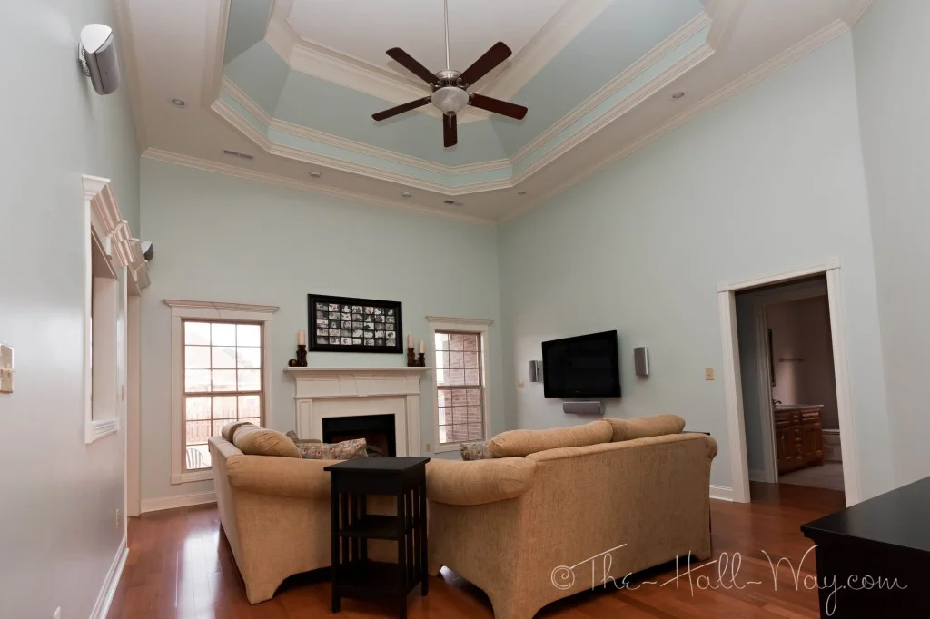
SHERWIN WILLIAMS RAINWASHED - SW 6211
Sherwin Williams Rainwashed. This is a lovely color. However, beware of how much brighter and blue-r it will look on the wall. As we all know, these itty bitty paint chips can be deceiving and this blue-green is definitely more intense than you may think. I would use this in a room where you definitely want a bolder color. Here are a few rooms painted in this color.
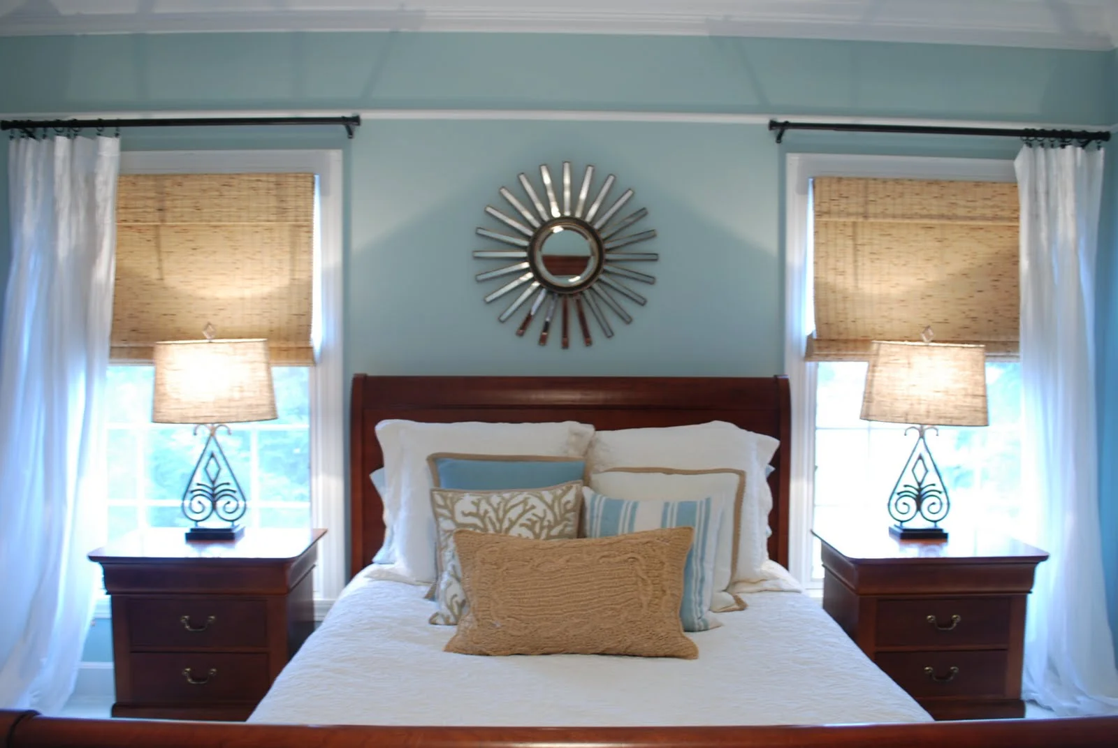

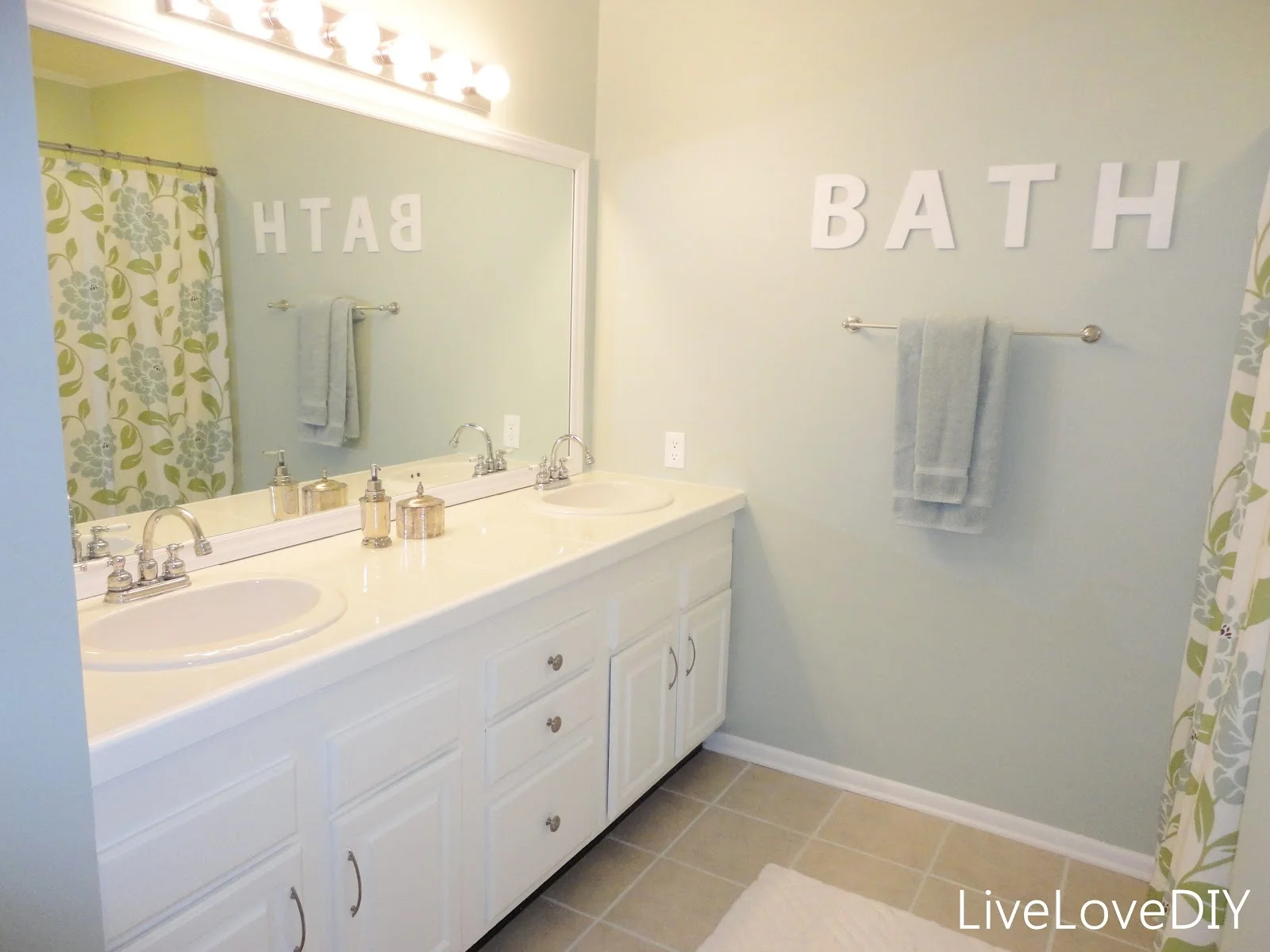
SHERWIN WILLIAMS SEA SALT - SW 6204
Next we have one of my personal favorites: Sherwin Williams Sea Salt. This paint color is named perfectly; it really does have a soft, beachy feel. It has more green undertones than blue, but it constantly changes with the light. On cloudy days, it looks like a gray-blue and on sunny days it has more of a sea foam color. So lovely. My parents painted their kitchen and living room this color and it looks fantastic with white trim and light color wood. Here are some rooms painted SW Sea Salt.

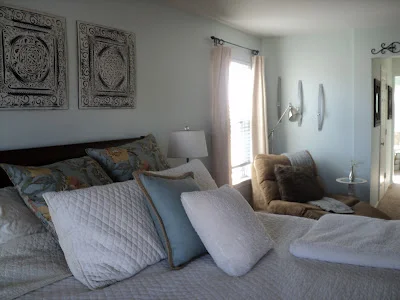
VALSPAR WINTER IN PARIS
I will be the first to admit that I am not too familiar with Valspar's collection, but I spotted Valspar Winter in Paris last time I was in Lowe's and fell in love. To me, it is the perfect combination of blue, gray, and green. It is light without being too faint. I plan on using this in the living room in the Myrtle House. (Update: we didn't end up using it in the Myrtle House, BUT we did use it in this Master Bedroom - click for photos.)


SHERWIN WILLIAMS WINDOWPANE - SW 6210
Last but not least is Sherwin Williams Windowpane. This is another very pretty light blue green. I would say this is less gray and is more saturated than the others, but it is also very light and therefore not over-powering.
I think one of the most important things to do when picking one of these blue-green colors is to determine what kind of light the room you are painting will get. If it gets a lot of morning sunlight, typically the color will appear more blue. It it gets a lot of warm afternoon light, the color will be more green. If it is a room without a lot of windows, the color may appear more gray. Before committing to a gallon, buy a tester and live with the swatch on your wall for a few days. This will help you to determine if you love the color around the clock.
I hope this helps! Please do tell - what are your favorite light blue/green paint colors?